1.2k dead clicks on the terms checkbox, and a bug that wasn't.
Dima reproduced it, Nitza designed it, and in about one workday we went from "bug?" to a measured fix.
In Clarity, the tool that records sessions on the site, I saw something worrying.
About 1.2k dead clicks on the terms checkbox text, and about 1.2k on the checkbox itself. Right next to the payment button, in the mobile checkout.
A dead click is a click that does nothing. So I asked Basher for a reproduction. (Basher runs my shluchim. That’s Hebrew for “emissaries”, and it’s what I call my AI agents.)
The reproduction:
Dima, the QA (quality assurance) shaliach, ran 8 Playwright runs on the live site. Playwright is an automated browser that clicks like a user.
iPhone, Android and desktop. As a guest and signed in, on the cart page and the shipping page. Without paying.
The result: it’s not a bug. 48 out of 48 clicks checked the box.
Clarity’s numbers look like an attribution distortion, across the whole session. For example, 10 clicks on the text, but 224 dead ones.
The real problem:
Everything competes for the same tap.
Three policy links cover about 68% of the text. The checkbox itself is just 24px. And the UserWay accessibility button (an accessibility plugin for the site) can cover it.
What others do:
I asked for Nitza, the UX (user experience) shaliach, to look at what other sites do.
Dima researched GOV.UK and WCAG 2.5.8, the accessibility standard for target size. Also the size guidelines from Apple and from Material, Google’s design language, Shopify’s and Amazon’s implied consent, and the checkout at Steimatzky, a big Israeli bookstore chain.
Nitza built a live mock in RTL (right-to-left), measured everything in Playwright, and proposed three options.
The decision:
I asked whether to drop the links altogether, since they’re already in the footer.
The research and Nitza said no. Keep the links next to the consent point, because that makes the consent legally stronger.
I chose option A. A clean consent row, with a 44×44px tap area and a 48px row height.
The three links get their own row, below. On mobile they open a bottom sheet, so the cart never gets lost. And it all fits on one line even at 360px.
Original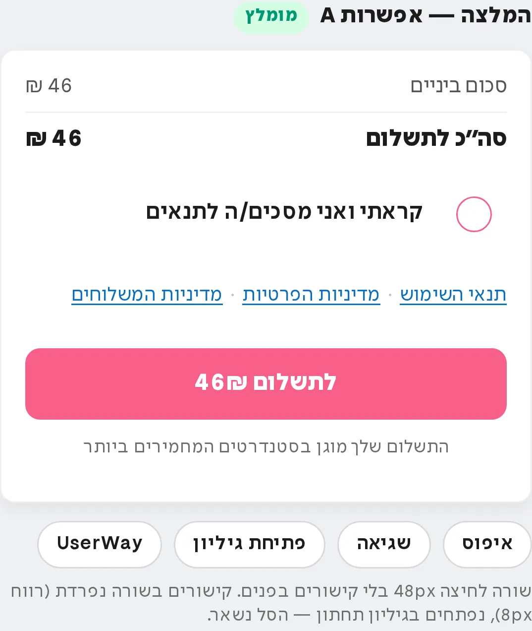 Pinch, double-tap or scroll over the image to zoom. Drag to move.
About one workday, from “bug?” to a verified “not a bug”, and a measured fix.
What to take from this:
Reproduce before you fix. 1.2k dead clicks sounded like a bug. 48 out of 48 showed it wasn’t.
Don’t trust a single number. 10 clicks and 224 dead ones points to a measurement problem, not a site problem.
Ask what others do. The research kept the links where they matter.