From idea to engineering in two days: a spec-driven design process for the ticket bundles page.
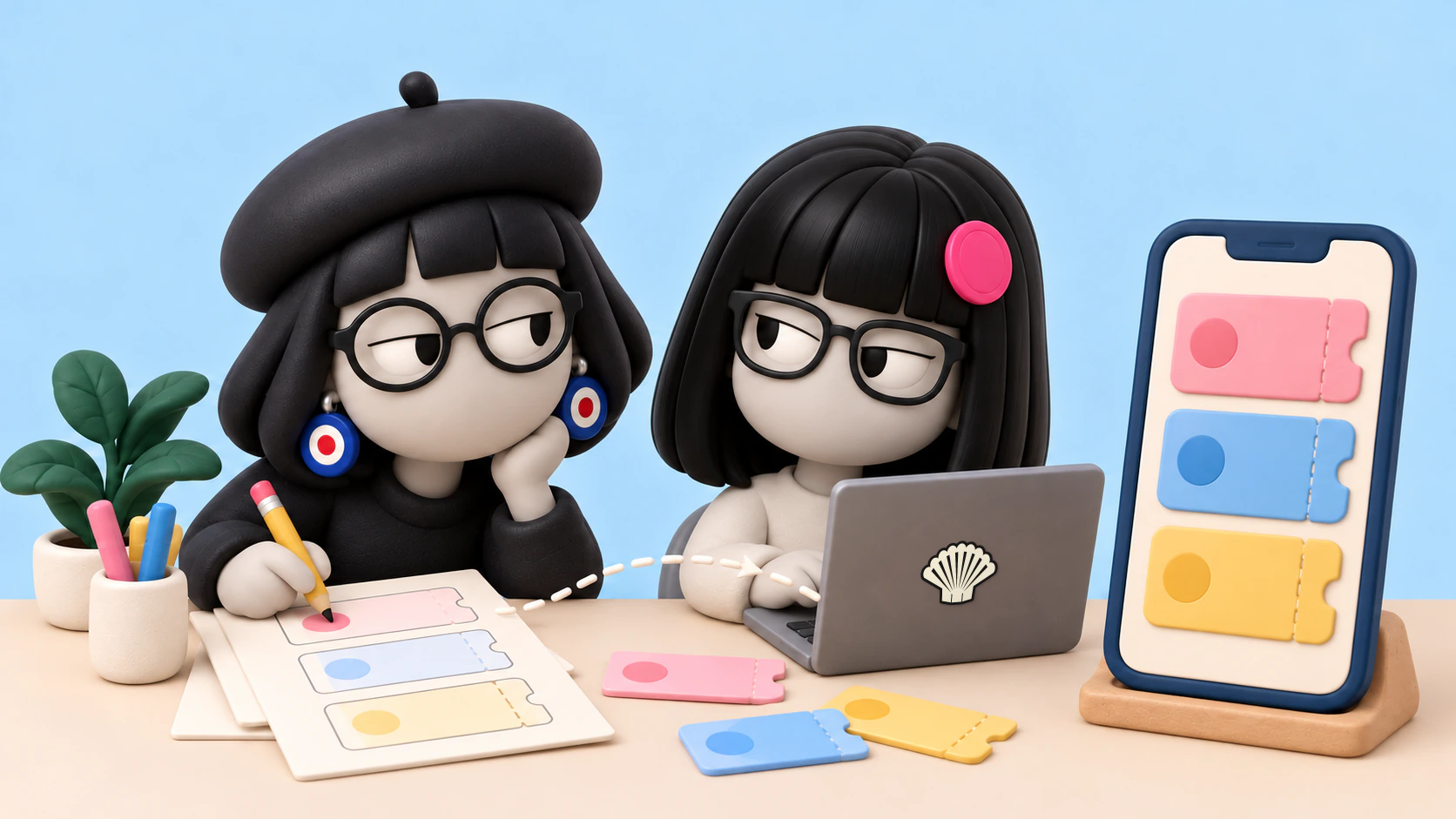
Nitza, my AI designer, researched and built a repeatable design process, and its first run took our ticket bundles page all the way to a developer handoff.
 Pinch, double-tap or scroll over the image to zoom. Drag to move.
I wanted a spec-driven process, but for design. Meaning work that starts from a written spec, not from a moment of inspiration.
I didn’t want to reinvent the wheel. I wanted something that produces high quality and can be repeated.
I told Nitza: first, research proven processes. (Nitza is one of my shluchim. That’s Hebrew for “emissaries”, and it’s what I call my AI agents.)
Within two days, October 7 to 8, 2026, the workflow was up. And the first real run went through it: a redesign of the ticket bundles page, all the way to a handoff package (a structured transfer document) for Kochava.
At the end I said:
That was a really excellent workflow.
Hebrew original
זה היה workflow ממש מעולה
Day 1, building the process:
Nitza researched Spec Kit, BMAD, Google DESIGN.md, Shape Up, GOV.UK, Linear and more. All of it became a proper research report.
The stages we set:
- Brief.
- Mood board.
- Lo-fi (a rough sketch) in Figma, 3 directions in black and white.
- Hi-fi (a finished design) as a live prototype, with e-vrit’s design system.
- A multi-model review.
- Up to 2 or 3 revision rounds, with a quality gate.
- Handoff to Kochava.
The review works like this: Codex, Claude and Gemini, each in three runs, against a shared rubric (a scoring criteria table).
The rubric checks hierarchy, readability in Hebrew, brand fidelity, accessibility, and clarity of the main action.
Then it takes the median, compares it against the live page, and ranks issues by severity: Blocker, High, Medium and Nit. There are persona questions too.
A Replicate shaliach was added for the mood boards. And design skills were added: Emil Kowalski, Figma, Anthropic, Addy Osmani, and OneRedOak adapted for RTL (right-to-left writing) and dark mode.
It was all saved as a reusable skill, spec-driven-design.
Day 2, the run on the ticket bundles page:
The brief pulled together a lot of sources. Earlier research, my feedback, the voice of the customer from Glassix, and business context from Basher. Plus data from GA4 and Clarity, and code facts from Kochava.
What the data showed: mobile is about 75% of users.
The book lovers’ bundle brings in about 69% of bundle revenue, but on mobile it sat about 750px down the page.
The link to the book list was the most tapped. And there were about 600 dead clicks, taps that did nothing, across the cards.
Research on prepaid vs. subscription shaped the copy:
- Lead with the number of books and the price per book, no discount percentages.
- “One payment, no subscription.”
- Valid for 5 years.
- One honest “not for you if” line.
- A gift framed as “they pick the books”.
I approved the lo-fi in Figma. The chosen headline: “Your next book is already yours. And the one after it.”
The hi-fi was a live prototype in Next.js. With fonts, tokens, live covers, and prices and quantities from the site’s API.
The recommended card was chosen by a sort in the DB, not hard-coded.
The review: 3 rounds, times 3 models, times 3 runs.
In round 1, there were two Highs that every model flagged. A confusing “and 29,364 more books” line, and a chart that looked like a banking app.
Both were fixed. Gemini’s score went up from 69% to 92% by round 2.
All three models rated the new page better than the live one, on every factor and in every round.
Then an independent checker, one that didn’t build the page, caught a High that every model missed. The models had only seen screenshots. And tapping a cover did nothing.
It was fixed in one line, and verified in 22 out of 22 taps, on mobile and desktop.
Kochava answered questions from the code, and caught a wrong claim about gifts in the copy. The recipient doesn’t pick a book right away, and that was fixed.
My live fixes were saved as permanent taste rules:
- No gradients.
- Only the last word of the headline in the accent font.
- Card colors automatic by position, no managing them in the DB.
- Secondary cards in the same full design, at every width.
- Only the recommended card gets a subtitle.
Now there’s a handoff package for Kochava, to build it in a separate redesign branch, including measurement requirements before an A/B test (a trial between two versions).
Original Pinch, double-tap or scroll over the image to zoom. Drag to move.
Original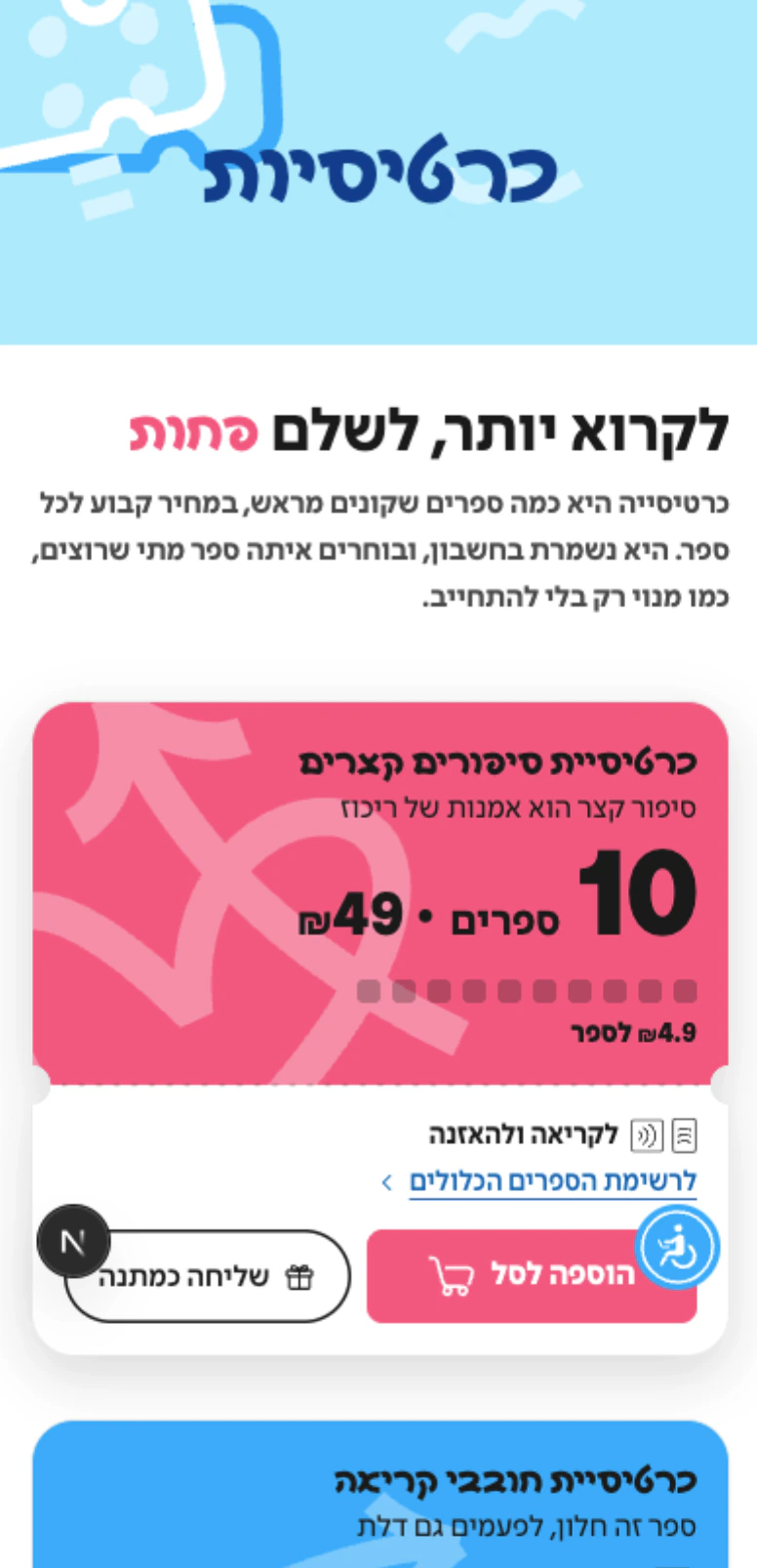 Pinch, double-tap or scroll over the image to zoom. Drag to move.
Why it was excellent:
Pretty design was never the goal.
What I got is a repeatable process, with data, code and a multi-model review. Plus an independent check that catches what a screenshot can’t see.
From a day of research to a handoff ready for the team.
What to take from this:
Research proven processes before you build a workflow. Nitza didn’t invent it from scratch. The report saved weeks of trial and error.
Several models, plus a checker who didn’t build it. Each one catches something different. The screenshots missed the cover tap, and the interactive check caught it.
Data and code before copy. GA4, Clarity, Glassix and Kochava prevented wrong claims about the gift, the position of the recommended bundle and the price per book.
Taste rules get saved. Every live fix of mine becomes a rule. The next run starts from a higher bar.